
An accent wall should feel like a deep breath, not a jump scare. The sweet spot is a bold moment behind your headboard that anchors the room, then everything else stays calm and cozy so your eyes can rest. I thrift and rearrange my way through bedrooms all the time, and the most successful accent walls all have one thing in common: they are balanced on purpose.
Let’s talk color and pattern ideas that bring personality to your sleep space without making it feel busy or smaller than it is.
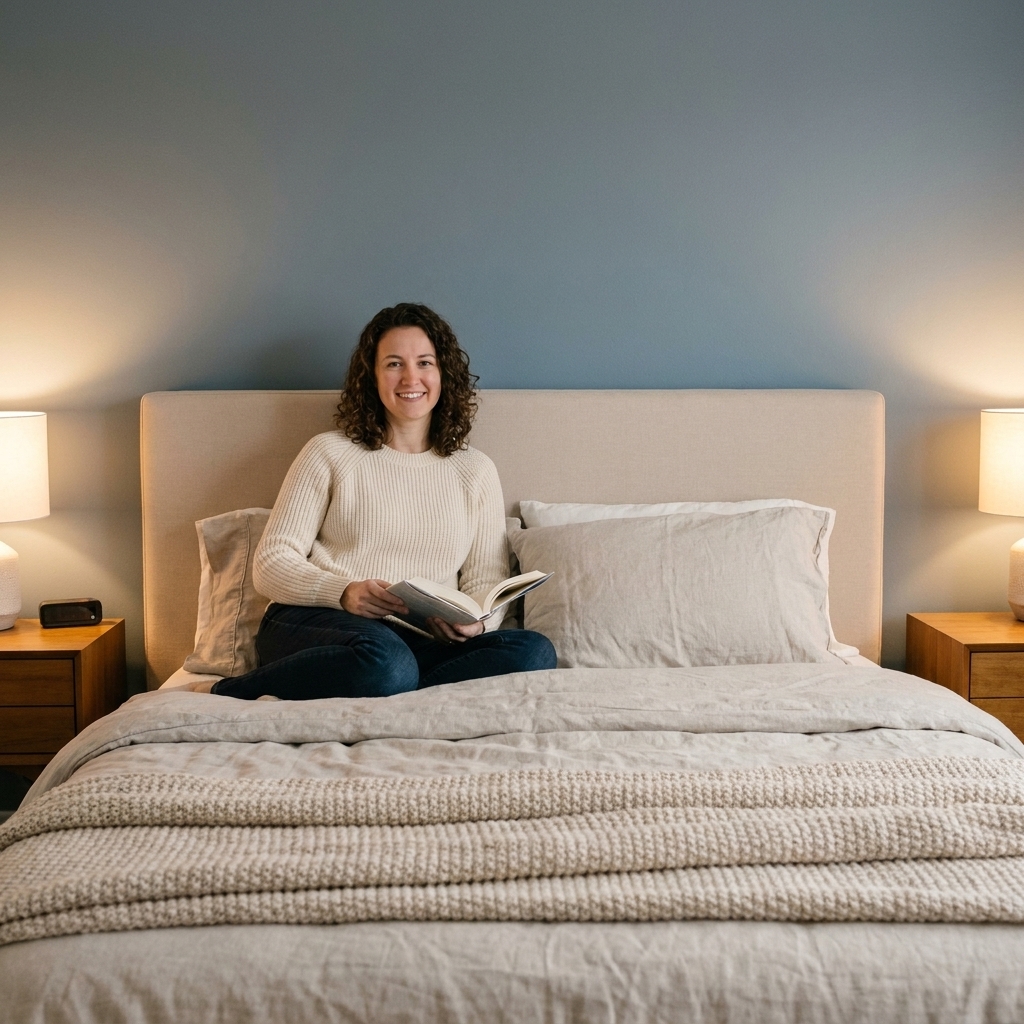
Choose the right wall first
If you want maximum impact with minimum overwhelm, placement does most of the work for you.
Best option: the headboard wall
Behind the bed is the natural focal point, so an accent wall there reads intentional, even when the color or wallpaper is bold. It frames the bed like a backdrop and visually “contains” the statement.
Other options that can work
- A wall with a dresser if it is the secondary focal point and you keep styling simple on top.
- A nook wall like a reading corner or small vanity area, especially in studios or oddly shaped rooms.
- Half wall at about chair-rail height (roughly 36 to 48 inches) behind the bed if your ceilings are low and you want a grounded look.
Walls I usually avoid accenting
- The window wall because curtains, blinds, and daylight already add visual activity.
- The door wall because it feels chopped up, unless your door is centered and you are doing a very subtle color shift.
Color ideas that feel bold but still restful
In bedrooms, I like “moody and softened” over “bright and loud.” Think colors with a little gray, brown, or black in them. They read sophisticated and cozy, not chaotic.
1) Deep greens (instant sanctuary)
Try pine, olive, or a muted emerald. Many people find green calming, and deeper shades can make the bed feel tucked-in and grounded.
- Pairs well with: warm white bedding, walnut or oak nightstands, brass or black hardware, and creamy linen curtains.
- Keep it balanced: repeat the green elsewhere, like a throw pillow or a small piece of art.
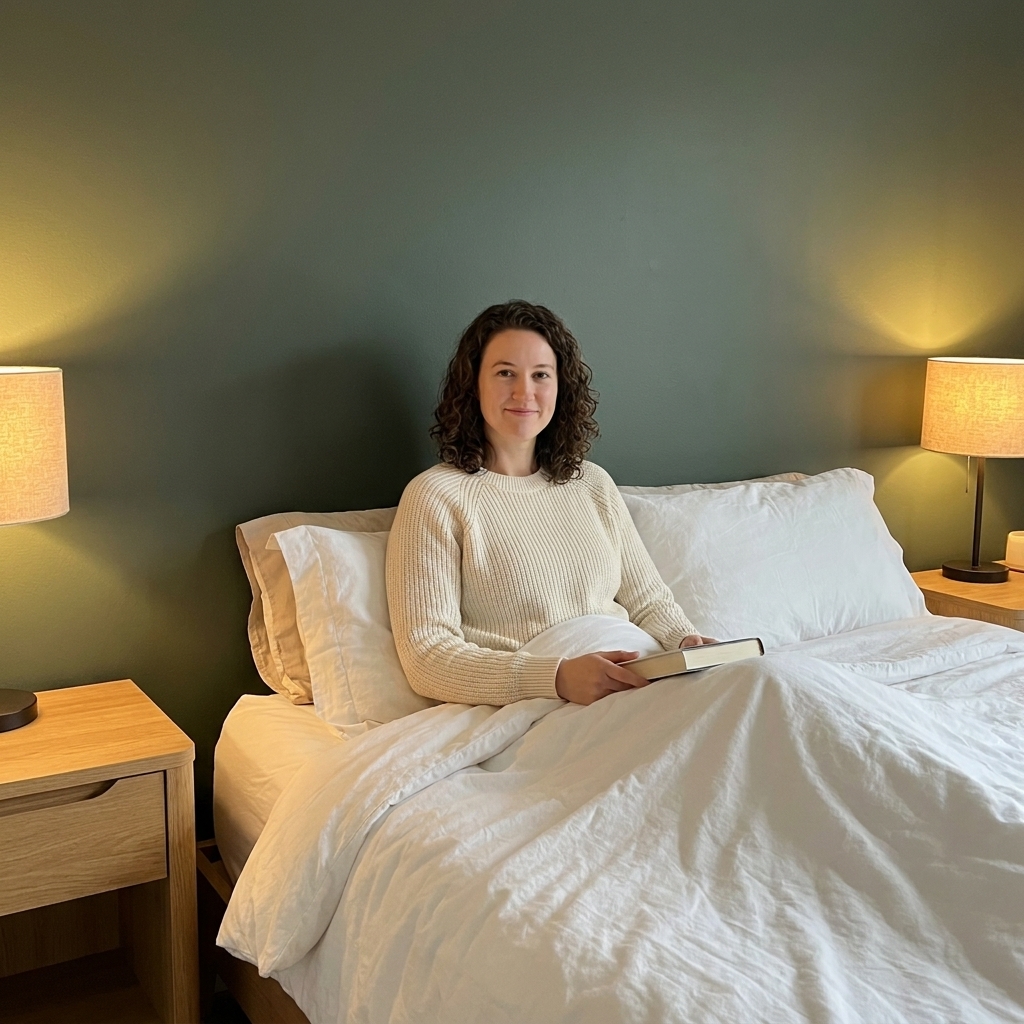
2) Dusty blues (quiet, not cold)
Skip the bright sky blues and go for slate, denim, or smoky blue. They feel serene, especially if your room gets a lot of warm afternoon light.
- Pairs well with: ivory, sand, and caramel tones, plus brushed nickel or matte black.
- Keep it balanced: choose art with warm neutrals so the wall does not lean icy.
3) Warm clay and terracotta (cozy glow)
If you want warmth without going neon, clay tones are magic. They make skin tones look good in mirror light too, which is a fun bonus.
- Pairs well with: creamy bedding, rattan, vintage wood, and soft gold lighting (think warm LEDs).
- Keep it balanced: go lighter on the rest of the room, especially if your floors are dark.
4) Charcoal and soft black (dramatic, but calming)
A near-black accent wall behind the headboard can feel like a fancy boutique hotel when the textiles are plush and the lighting is warm.
- Pairs well with: white or oatmeal bedding, layered textures, and at least two light sources (bedside plus overhead or a floor lamp).
- Keep it balanced: add one reflective element like a mirror, glossy ceramic lamp, or a framed print with glass.
5) Tonal neutrals (the safest “bold” choice)
Not every accent wall has to shout. A shade that is a couple shades deeper than your main wall color adds depth without stealing the whole room.
- Examples: mushroom, greige, warm taupe, stone, soft cocoa.
- Keep it balanced: focus on texture, not contrast, like linen, bouclé, chunky knits, and woven baskets.
Wallpaper patterns that won’t take over
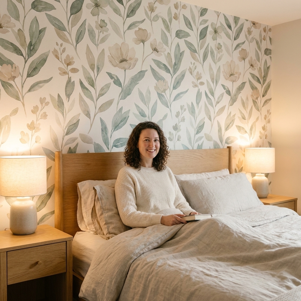
Wallpaper gets overwhelming when the scale is wrong or the contrast is too harsh. If you want pattern behind the bed and peace everywhere else, aim for either low contrast or lots of “breathing room” in the design.
1) Large patterns with negative space
Yes, large patterns can be calmer than tiny ones. Tiny repeats can look busy from across the room, while a larger motif reads like art.
- Look for: oversized botanicals, airy palms, big abstract brushstrokes, loose watercolor florals.
- Styling tip: keep bedding simple. Solid or very subtle texture is your best friend.
2) Soft geometrics (structure without noise)
A gentle geometric can make the room feel designed and tidy, especially in modern or mid-century spaces.
- Look for: tonal chevrons, thin-line arches, subtle grids, small diamonds in close shades.
- Balance trick: echo the geometry once, like a ribbed lamp base or a mirror with a curved frame.
3) Stripes that stretch the room
Stripes are a classic for a reason. They add interest and can visually change proportions.
- Vertical stripes: make ceilings feel taller.
- Horizontal stripes: make a narrow wall feel wider.
- Keep it restful: choose stripes in soft contrast, like cream and sand, or two close blues.
4) Textured look wallpapers (quiet depth)
If you love the idea of wallpaper but want it subtle, go for texture effects. They add depth in a quiet way.
- Look for: grasscloth look, linen look, plaster look, soft metallic wash.
- Note: real grasscloth is gorgeous but can be pricey and more delicate. Faux versions give a similar vibe with easier upkeep.
My “don’t overwhelm” rules
These are the guardrails I use when I’m styling a friend’s rental bedroom or tweaking my own setup after one too many thrift finds.
- Pick one star. If the wall is patterned, keep bedding calmer. If bedding is patterned, keep the wall solid.
- Limit the palette. Aim for 3 main colors in the whole room, plus one metal finish.
- Repeat the accent 2 to 3 times. Once can feel random. A couple repeats makes it look like a plan. Try a pillow and a small vase, or a throw and a print.
- Soften the edges with textiles. Tall curtains, an upholstered headboard, and a cozy rug help any bold wall feel intentional and warm.
- Warm lighting matters. Choose warm bulbs and use two to three light sources. Bold walls can look harsher under cool, bright lighting.
Small bedroom tricks
In small rooms, the goal is depth, not clutter.
Go darker behind the bed
It sounds backwards, but a deeper color can add perceived depth and make the bed feel more tucked in. The key is keeping the other walls lighter and the bedding airy.
This is one I learned the hard way. I once painted a tiny bedroom a moody green and thought I had made a mistake until I swapped the bulbs to warm and added a second lamp. Same paint, totally different mood.
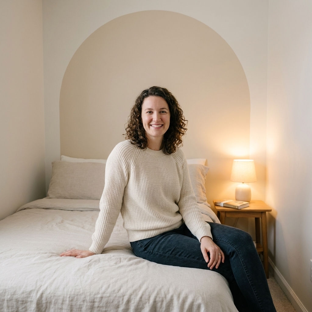
Try a painted arch or panel
If full-wall color feels like too much, paint a shape behind the bed. It gives you the accent moment without wrapping the whole room in it.
- Easy shapes: a tall rounded arch, a wide rectangle that mimics a headboard, or two slim vertical “panels.”
Keep the pattern scale right
For small bedrooms, avoid tiny high-contrast prints. If you want wallpaper, choose large scale with soft contrast, or a textured look.
Rental-friendly options
If you rent, you can still have an accent wall moment without losing your deposit.
- Peel-and-stick wallpaper for the headboard wall. For the best chance of clean removal, apply to a smooth, clean surface and avoid heavily textured paint.
- Temporary mural panels (peel-and-stick in vertical drops) so you can remove one section at a time.
- Fabric wall using liquid starch: smooth a lightweight cotton or linen blend onto the wall and peel off later. This is great for subtle pattern.
- Oversized art as an “accent wall” if you are truly commitment-shy: one big piece centered over the bed gives a similar focal point effect.
Quick real-talk note: “removable” varies by wall and paint. Peel-and-stick can pull paint, and liquid starch can leave residue on some flat finishes. If you are renting, test a small hidden spot first and double-check your lease.
Style the bed to match
A bold wall looks best when the bed feels like it belongs there. This is my favorite simple formula:
- One “base” bedding color (white, cream, oatmeal, light gray).
- One texture layer (linen duvet, quilted coverlet, or a chunky knit throw).
- Two pillow finishes (for example, crisp cotton shams plus one velvet or woven lumbar).
- One grounding element (a headboard, or if you do not have one, wall-mounted sconces or a long picture ledge).
Quick pairings
If you like a “tell me what to do” shortcut, here are combos that rarely fail.
- Muted olive paint + warm white bedding + vintage wood nightstands + brass lamps.
- Smoky blue paint + oatmeal linen duvet + black picture frames + soft cream rug.
- Clay paint + crisp white sheets + woven textures (basket, rattan lamp) + amber glass accents.
- Charcoal paint + ivory quilt + layered warm lighting + one large landscape print.
- Tonal greige wallpaper (linen look) + textured bedding + minimal art + one leafy plant.
Common mistakes (and easy fixes)
Mistake: the wallpaper is gorgeous but the room feels chaotic
Fix: simplify the bed. Choose solid bedding and pull one color from the wallpaper for a single accent pillow or throw.
Mistake: the accent wall feels like it is floating
Fix: add visual weight at the bed. An upholstered headboard, taller lamps, or sconces help “connect” the wall to the furniture.
Mistake: the color looks harsher at night
Fix: swap to warm bulbs and add a second lamp. Lighting is the difference between moody and muddy.
Mistake: you chose a bold color and now everything else looks wrong
Fix: bring in one bridging neutral. Creamy whites, warm taupes, and natural wood tones are great mediators.
FAQ
Should an accent wall be darker or lighter?
Most of the time, darker reads more like a true accent and helps the bed feel anchored. Lighter can work if you are doing a subtle tonal shift or a textured wallpaper look.
Can I do an accent wall if my headboard is patterned?
You can, but pick a quieter wall. If the headboard is patterned, I would go with a solid paint color on the wall and keep the bedding simple.
How do I keep wallpaper from looking too busy?
Choose one of these: low contrast (colors close together), larger scale motifs with negative space, or texture-based designs. Then limit other patterns in the room to one small moment, like a single pillow.
What paint finish should I use?
Eggshell is my go-to for bedrooms because it looks soft and, in many paint lines, is still fairly wipeable. Matte is beautiful and cozy, but it typically shows scuffs more easily unless you choose a washable matte formula.
Closing cozy tip
If you are nervous, start with a removable option or a color that is only a few shades deeper than your current wall. You can always go bolder later. The goal is a room that feels like you can exhale the second you walk in, with one beautiful backdrop that makes your bed the main character.