
Dark wood furniture has that heirloom, grounded energy I will never get tired of. Cherry, mahogany, and walnut bring instant warmth and make a bedroom feel finished. The only tricky part is keeping all that richness from turning into a cave, especially in rentals with limited light.
Below are my favorite color schemes that highlight wood grain and give your room a little more visual space. I will also help you spot undertones, choose a trim color, and tie everything together with textiles so your set looks intentional instead of heavy.

Start here: wood undertones
Before you fall in love with a paint swatch, figure out what your wood is doing undertone-wise. This one step saves you from that awkward moment where the walls make your cherry set look orange or your walnut looks a little green.
Quick undertone clues
- Cherry: usually red-leaning, sometimes slightly orange. It can read more red at night under warm bulbs. Also, cherry often deepens and mellows over time as it patinas.
- Mahogany: deeper red-brown, often a bit dramatic and formal. It tends to look best with softer, muted wall colors.
- Walnut: chocolatey brown that can lean neutral, cool, or occasionally slightly purple depending on the piece, stain, and finish.
My thrift-store trick: Put a plain white sheet of printer paper right up against the furniture in daylight. The paper gives your eye a “true white” reference so the undertone becomes obvious fast.
Best color schemes
These are the palettes I reach for when I want the wood to look expensive and the room to feel calm and open.
1) Creamy off-white + caramel accents
If you want a safe choice that still feels warm, go creamy instead of stark. Creamy whites keep dark wood from looking harsh, and they make the grain the star of the room.
- Wall color vibe: cream, ivory, soft linen white
- Best for: cherry, mahogany, and walnut, especially in north-facing rooms
- Accents: caramel leather, brass, natural jute or sisal, warm oak frames
Styling tip: Add contrast with bedding in layered whites, then sneak in warmth with a camel throw at the foot of the bed.
Paint direction: look for a warm white labeled “ivory” or “linen” with a soft yellow or pink undertone, not a crisp blue-white.
2) Greige + clean white trim
Greige is that magical in-between of gray and beige. It gives you a modern backdrop without cooling the room too much. With dark wood, greige feels tailored and calming.
- Wall color vibe: light greige, mushroom, putty
- Best for: walnut sets and darker cherry finishes
- Accents: matte black, brushed nickel, white linen
Trim note: Go a clean white on trim and ceiling to keep everything lifted. The contrast makes the furniture look extra intentional.
Paint direction: “mushroom” and “putty” shades are usually a safe starting point because they sit quietly next to both warm and cool finishes.
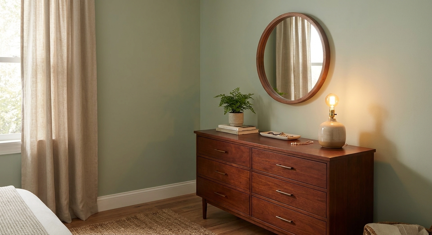
3) Soft sage + warm neutrals
Green and wood are best friends. A muted sage makes dark wood feel organic and relaxed, like a boutique hotel that actually lets you sleep in.
- Wall color vibe: dusty sage, eucalyptus, soft olive-gray
- Best for: walnut and mahogany, and cherry that is more brown than red
- Accents: oatmeal bedding, terracotta pottery, aged brass
4) Dusty blue + white bedding
Dusty, gray-leaning blues make dark wood feel classic and light. The key is choosing a blue that is softened, not a bright primary blue.
- Wall color vibe: smoky blue, denim blue, blue-gray
- Best for: cherry and walnut, especially if you want a slightly coastal calm
- Accents: white duvet, striped ticking, natural wood picture frames
Lighting tip: Blue walls can feel cooler at night, so use warm bulbs (around 2700K to 3000K) in bedside lamps for that cozy glow.
5) Blush-beige + burgundy details
This one is surprisingly good with cherry and mahogany. A blushy beige calms the red undertone while still feeling warm and romantic. Keep it subtle, not bubblegum.
- Wall color vibe: blush-beige, rosy nude, soft clay-leaning beige
- Best for: cherry and mahogany sets
- Accents: burgundy pillow, vintage brass, creamy curtains
Balance trick: If your furniture is very red, keep accessories more neutral so the palette does not tip too rosy.
Paint direction: search for “rosy beige” or “nude” tones that read neutral in daylight, then let textiles do the richer color.
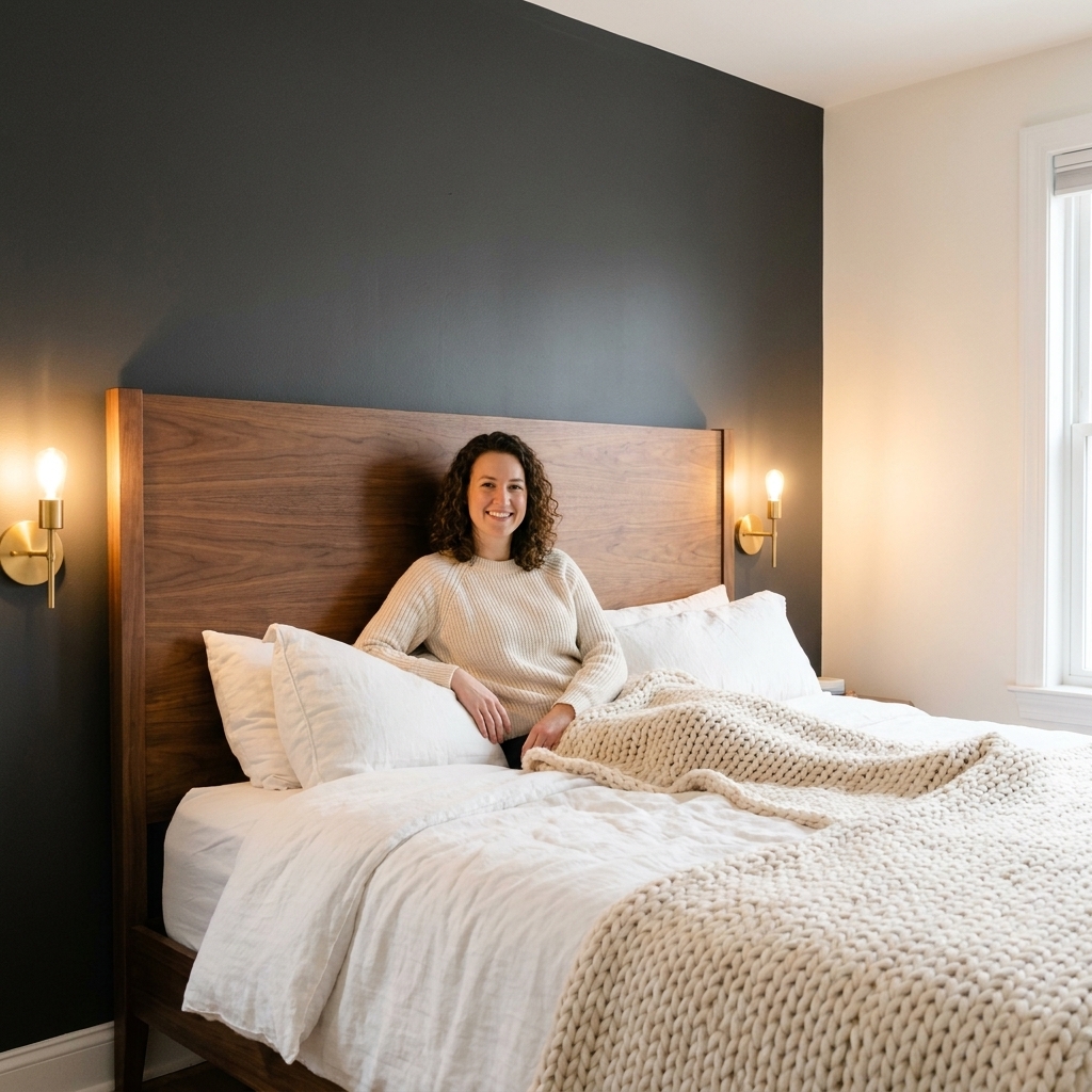
6) Charcoal accent wall + warm white
If you want drama but not darkness, do one deep wall behind the headboard and keep the rest warm white. Dark wood pops against charcoal, and the room can still read bright.
- Wall color vibe: charcoal, soft black, deep graphite
- Best for: walnut and mahogany, especially in larger rooms
- Accents: crisp white bedding, brass sconces, textured rugs
By wood type
Cherry: warm, not orange
Cherry can go from rich to pumpkin-ish if paired with the wrong yellow. Choose colors that are warm but not too golden. And remember, cherry often darkens over time, so leave yourself room for it to get richer.
- Great choices: creamy off-white, soft greige, dusty blue, blush-beige
- Skip (usually): strong butter yellow, super warm tan with a lot of orange
Mahogany: soften it
Mahogany is gorgeous, but it can feel heavy if the walls are too dark or too saturated. Muted is your best friend here.
- Great choices: warm white, sage, mushroom greige, smoky blue
- Skip (usually): bright jewel tones on every wall, true bright red accents
Walnut: flexible
Walnut is the most flexible. It looks stunning with modern cool tones and also plays nicely with cozy creams.
- Great choices: greige, crisp warm white, charcoal accent, sage
- Skip (sometimes): icy gray in a low-light room, which can make walnut look flat
Keep it from feeling dark
If your bedroom feels smaller than it is, it is usually not the furniture. It is the contrast, the lighting, and what is happening above and around the pieces.
Light top, grounded bottom
- Keep walls and bedding lighter than the furniture.
- Choose a rug that is mid to light in value, especially under the bed.
- Hang curtains high to pull the eye up.
Window coverings that work
If you love blackout curtains for sleep, you can still keep the room feeling lighter. Choose blackout panels in a light color, hang them high and wide, and add a sheer layer for daytime. You get the darkness at night without the heavy look during the day.
Pick the right sheen
Flat paint often hides wall flaws, but it can absorb light depending on the brand and your wall texture. In a dim bedroom, I usually like eggshell on walls because it tends to reflect a bit more light without looking shiny.
Layer lighting
- Overhead: keep it on a dimmer if you can
- Task: bedside lamps or sconces for reading
- Ambient: a small lamp across the room, or a warm LED strip tucked behind a headboard
Dark wood glows under warm light. Cooler daylight bulbs can make it feel a bit stern.
Bedding and decor combos
When people tell me they are stuck styling dark wood, it is usually because everything is the same depth and the bed disappears. Textiles fix that fast.
- For a bright, clean look: white duvet + oatmeal quilt + textured cream pillows
- For cozy cottage vibes: floral or block print shams + warm white sheets + knit throw
- For modern calm: solid linen bedding in flax or clay + matte black hardware + minimal art
- For hotel energy: crisp white bedding + charcoal throw + one accent pillow in rust or deep green

Floors, mixed woods, metals
Floors change everything
- Dark floors: keep walls lighter (warm white, light greige, soft sage) and use a lighter rug to break up all the depth.
- Light floors or carpet: you can go a touch moodier on the walls (dusty blue, deeper greige, charcoal accent) without the room feeling like a cave.
Mixing wood tones
Most real bedrooms are a mix, not a perfectly matched set. The easiest way to make mixed woods look intentional is to repeat tones at least twice. For example: walnut bed, then bring in walnut again in a frame, bench, or mirror, and let your nightstands be oak.
Hardware and light-bouncing finishes
Warm metals like brass and aged bronze flatter cherry and mahogany. Walnut can go either way and looks equally sharp with black or brushed nickel. If the room is dim, add a mirror, a glass lamp, or a glossy ceramic vase to bounce light around without changing your whole palette.
Paint sampling
I have painted enough rentals to know that a tiny paint chip can lie. Here is the method that saves time and money.
- Pick 3 to 5 contenders that share a similar vibe (all warm whites, all sage greens, etc.).
- Test them on poster board and tape them near the furniture and near a window.
- Look morning, afternoon, and night. Dark wood changes with lighting, so your paint will too.
- Check undertones next to your bedding. The bed takes up visual real estate, so let it vote.
Quick FAQ
Should I paint walls white with dark wood?
White can be perfect, but I prefer a warm white or creamy off-white with cherry, mahogany, and walnut. It keeps the room cozy and makes the wood look richer, not harsh.
Do gray walls go with dark wood?
Yes, as long as the gray is not icy. Look for greige or a softened gray with a hint of warmth, especially in bedrooms that do not get a ton of sun.
What brightens a bedroom with dark wood?
Creamy off-white is the easiest brightener, followed by light greige. If you want color, a soft sage or dusty blue can still read light while adding personality.
What trim color works best?
A clean, simple white trim is the most versatile. If your walls are creamy, choose a trim white that is not stark blue-white so it does not look sharp next to the warmth of the furniture.
Can't-miss combos
If you want a quick decision, pick one of these and style from there:
- Walnut + light greige + white bedding + black accents
- Cherry + creamy off-white + brass lighting + camel throw
- Mahogany + soft sage + oatmeal linen + terracotta details
Once the walls and bedding feel balanced, the rest is the fun part: a thrifted lamp, a cozy rug, and a nightstand that makes you smile every time you set your chamomile down.