
If you’ve ever brought home a “perfect” throw pillow and then stared at your bed like, why does this look wrong? you’re not alone. Bedrooms are tricky because we want them to feel restful, but we also want them to have personality. The 60-30-10 rule is a widely used design guideline, and it’s the easiest shortcut I know for getting a balanced color story without overthinking every purchase.
Think of it like building an outfit: a main neutral, a supporting layer, and then jewelry. Same idea, just with paint, furniture, and the fun stuff.
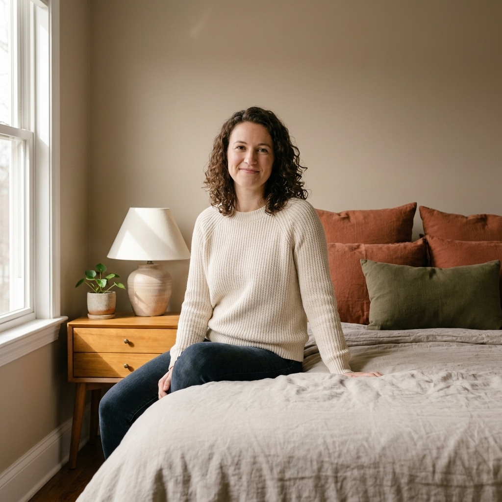
What 60-30-10 means
This guideline divides your room’s colors into three roles, based on how much visual space they take up:
- 60% Dominant color: the backdrop. Usually your wall color plus the biggest surfaces (sometimes curtains or a large rug).
- 30% Secondary color: the support. Think bed frame or headboard, dresser, nightstands, an upholstered chair, and your larger bedding pieces like a duvet or quilt.
- 10% Accent color: the spark. Pillows, art, lampshades, a throw, a vase, a small bench, even a stack of books.
It isn’t a math test. You’re aiming for a feeling of balance, not measuring square footage.
Step 1: Pick your 60% (calm base)
In a bedroom, your dominant color should tend to feel steady. That doesn’t mean it has to be beige. It just needs to avoid visually “shouting,” especially at night.
Great dominant colors for bedrooms
- Soft whites and creams: warm, clean, flexible with thrifted pieces.
- Greige and warm taupe: cozy, forgiving in rentals, great with wood.
- Dusty blue and muted sage: color without chaos, especially with decent natural light.
- Moody charcoal or deep navy: many people find these soothing when bedding and lighting stay soft.
Where the 60% shows up
- Walls (paint or wallpaper)
- Large curtains
- A big area rug if it dominates the floor
- Sometimes the main bedding color if your walls are white
My tip: If you rent and can’t paint, treat your largest textile as the “wall color.” A big rug plus long curtains can become your dominant 60% and instantly change the mood.
Step 2: Choose your 30% (anchor)
Your secondary color keeps the room from looking flat. It’s usually carried by furniture tones and larger decor pieces that repeat around the room.
Easy secondary directions
- Wood tones: oak, walnut, pine, painted wood. Yes, you can mix woods. Keep the undertones friendly.
- Soft contrast neutrals: if walls are warm white, secondary could be mushroom, camel, or light gray.
- Deeper version of the dominant: dusty blue walls with a navy quilt or a charcoal headboard.
- Black as a line color: picture frames, curtain rods, and lamp bases that add structure.
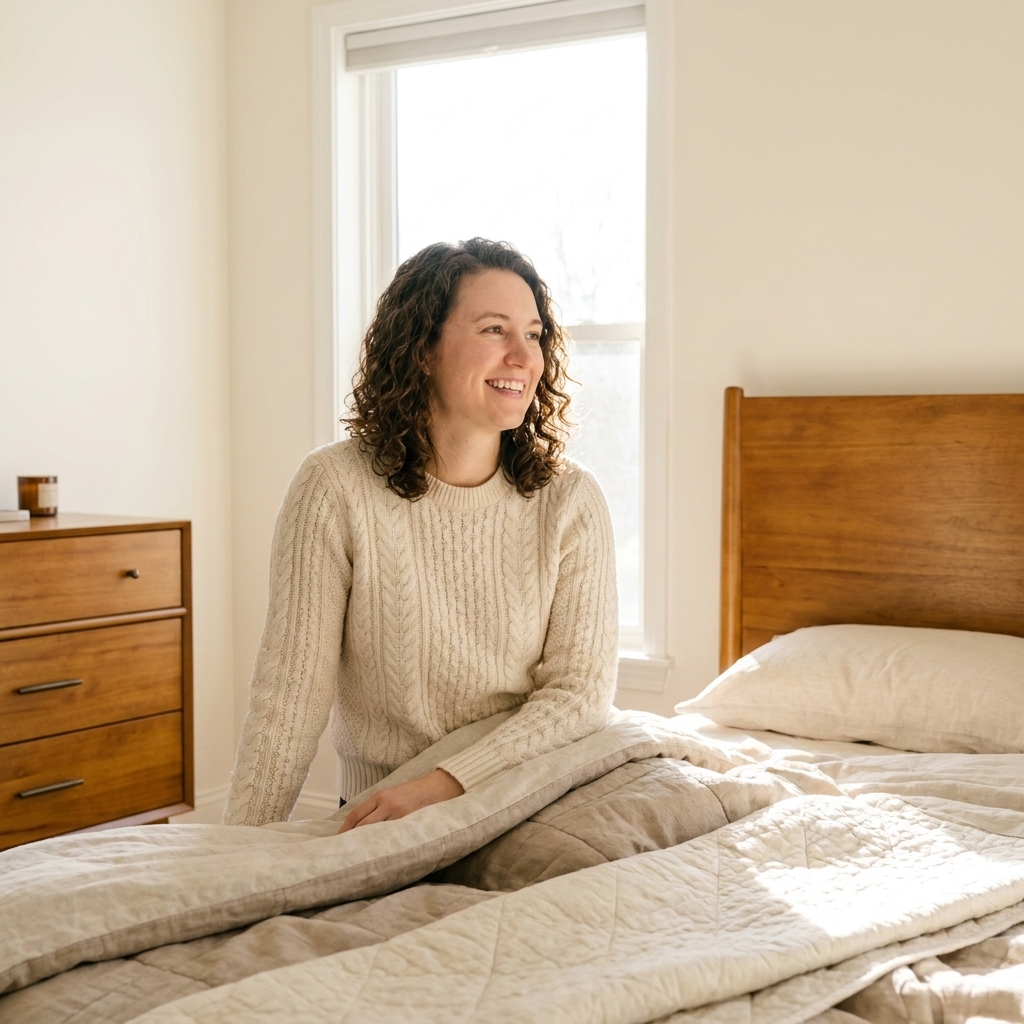
Practical shortcut: In most bedrooms, the bed carries a lot of visual weight. If your headboard, frame, or bedding base color is bold, it often becomes a big part of your 30%.
Step 3: Add your 10% (personality)
This is the part thrift shoppers live for. Accents are where you can be playful, seasonal, or trend-adjacent without repainting the whole room.
What counts as accent
- Throw pillows and the throw blanket
- Artwork and frames
- Lampshades, candle holders, vases
- A decorative tray on the dresser
- A small stool or bench at the end of the bed
Keep it intentional: Aim for 1 accent color (2 max) and repeat it at least three times around the room. Example: a rust pillow, a rust detail in your art, and a rust vase on the nightstand.
If you have a non-negotiable
Sometimes the room already has a loud opinion: red-toned wood floors, a bold inherited rug, or a duvet you’re not giving up. Instead of fighting it, treat that item as your starting point and build the ratio around it. If the rug is visually dominant, it’s basically your 60%. If it’s strong but smaller, it can act like the 30% or even the 10%, and you keep everything else quieter so it looks intentional.
Bedroom color combos
If choosing colors stresses you out, borrow a combo and make it your own with texture.
Soft and airy
- 60%: warm white walls
- 30%: light oak and sandy linen
- 10%: muted blue accents (pillow, art, ceramic)
Cozy and grounded
- 60%: greige or taupe walls
- 30%: walnut wood and creamy bedding
- 10%: terracotta accents (throw, vase, small rug detail)
Moody but calm
- 60%: deep navy walls
- 30%: crisp white bedding and black details
- 10%: brass accents (lamp, frame, hardware)
Fresh and natural
- 60%: soft sage walls
- 30%: warm cream textiles and natural rattan
- 10%: clay or blush accents
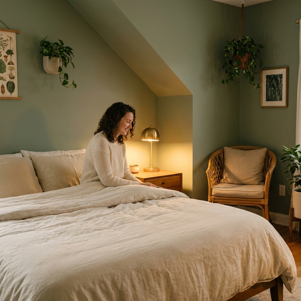
Small bedroom tips
Tiny rooms can feel busy fast, so 60-30-10 is extra helpful here.
- Keep the 60% simple: light walls, or a calm mid-tone, often helps the space feel more open.
- Use the 30% for big blocks: your bed, one dresser, curtains. Fewer large pieces means more breathing room.
- Keep accents tight: choose one accent color and repeat it, instead of adding five different “cute” colors.
- Swap pattern for texture: chunky knit, linen, and velvet add depth without visual noise.
My renter move: If you can’t paint and your walls are builder beige, treat that as your 60%. Bring in a clean 30% (white bedding plus wood furniture), then pick a single 10% accent you love. It’ll look styled, not stuck.
Mixing metals (without stress)
If finishes make you freeze, keep it simple: pick one “main” metal for the room (often what you see most, like curtain rods or drawer pulls), then add one supporting metal as the accent. Repeat each finish at least twice so it looks deliberate. Example: mostly black hardware with small brass moments in a lamp and a frame.
Common mistakes
Everything is accent
Fix: Pull your loudest color back into only a few items. Let bedding or walls do more of the heavy lifting in a quieter tone.
Your accent is scattered
Fix: Repeat the accent color three times. Pillow, art, and one small object on the dresser is enough.
The room feels flat
Fix: Add contrast through materials: matte walls plus a glossy lamp, nubby linen plus smooth cotton, light wood plus a black frame.
Undertones fight
Fix: Decide if you’re going warm or cool. Warm whites love camel, terracotta, brass, and honey woods. Cool whites love gray, navy, chrome, and ash woods.
Weekend shopping list
If you want a fast refresh without a total overhaul, this is the order I do it in:
- Lock in your 60%: paint, curtains, or a large rug.
- Set your 30%: headboard or bed frame tone, your casegoods (dresser and nightstands), and a bedding base like a duvet or quilt.
- Finish with the 10%: 2 pillows, 1 throw, 1 piece of art, and 1 small decor object in your accent color.
That’s it. Four or five accent items can be enough when your foundation is doing its job.
FAQ
Does 60-30-10 have to be three colors?
No. It’s three roles. Your 60% might be two close neutrals, and your 30% could be a mix of wood tones that read as one family. The point is a clear dominant, a support, and an accent.
Can patterns count?
Yes, and patterns make it easier. A patterned duvet can carry your 60% and 30% at once (background color plus pattern color). Then your 10% can pull one smaller color from that pattern.
What if I love lots of color?
Keep the hierarchy, just shift the shades. Example: 60% dusty teal, 30% warm clay, 10% mustard. Color lovers still need a visual order, especially in a bedroom.
How do I pick an accent that won’t feel trendy fast?
Choose an accent you’d happily wear, and buy it in smaller, swappable pieces: pillow covers, a throw, a thrifted vase, or a lampshade. If you get tired of it, you’re not repainting your life.
Sanity-check your palette
Before you commit, put your three colors next to each other in the room at the same time. That can be paint samples taped to the wall plus your bedding and a pillow, or a rug corner plus a curtain panel plus a thrifted vase.
Undertone cheat: Compare paint swatches next to bright white printer paper, then look at them again at night with your lamps on. Bedrooms live in evening light more than we think.
If it still feels calm after dark, you nailed it.