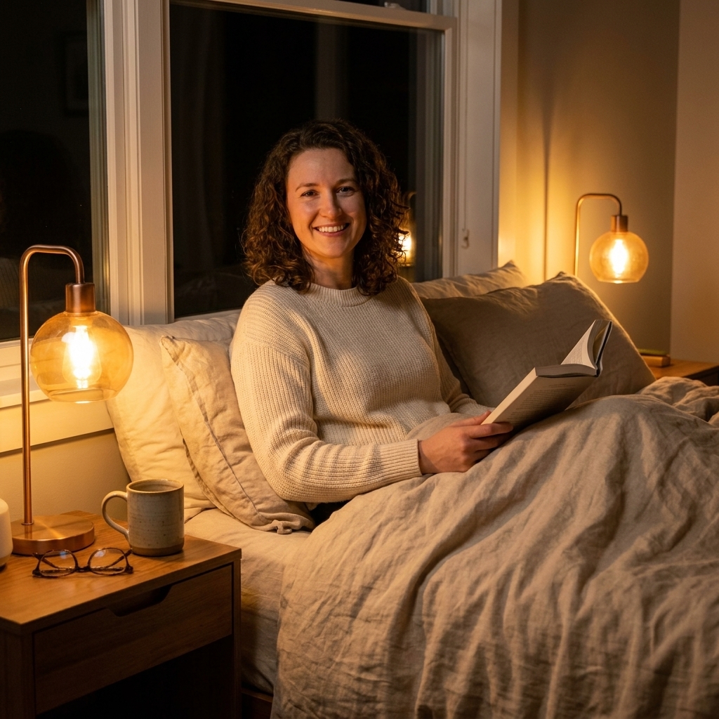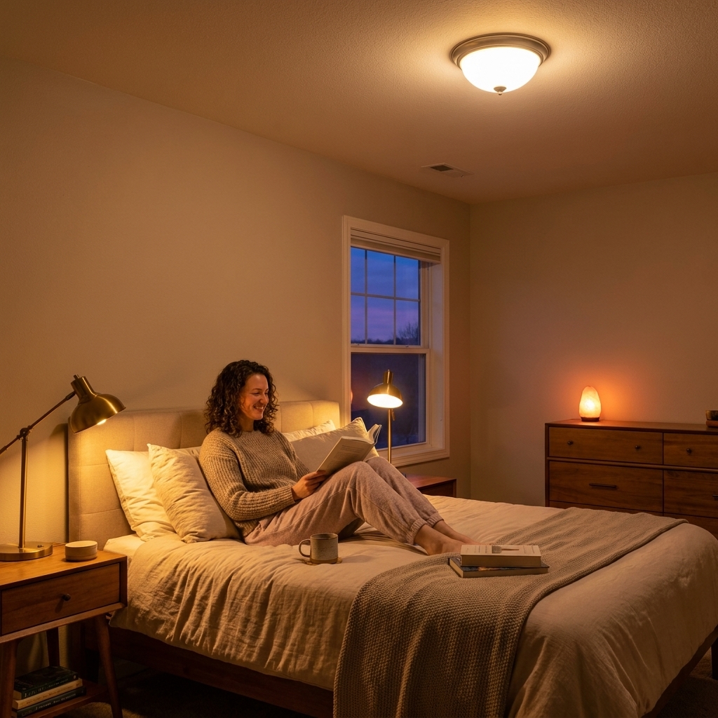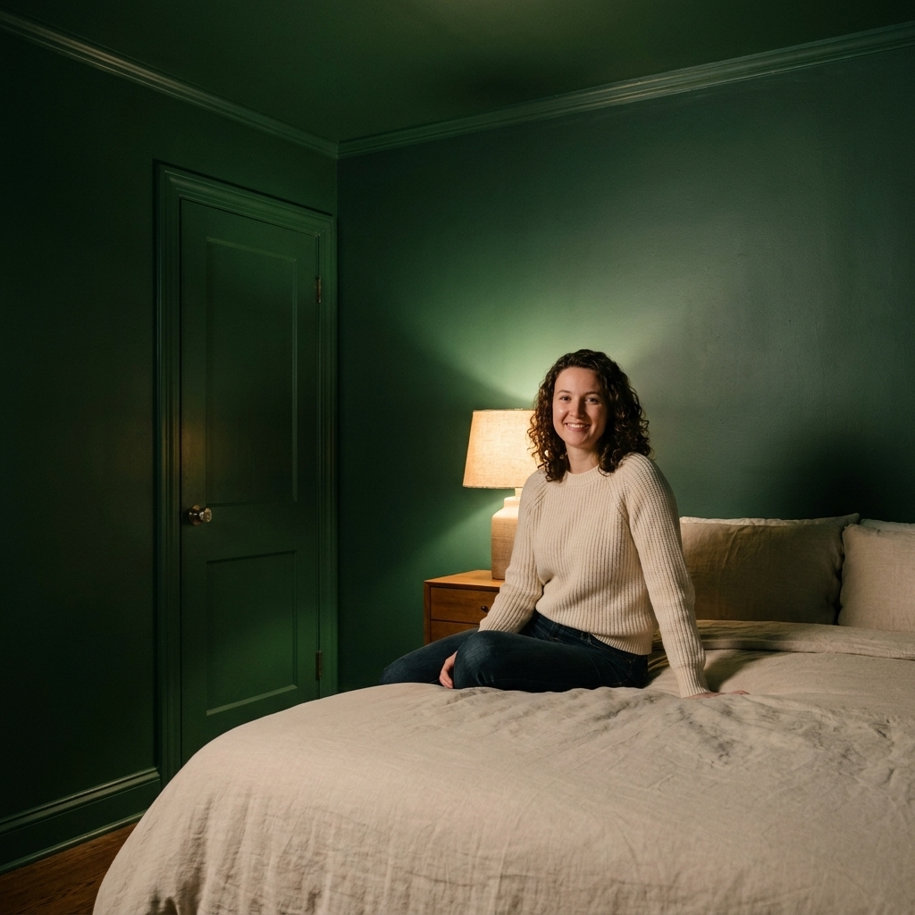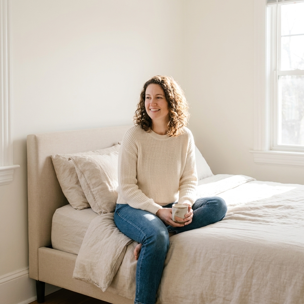
When I am helping a friend tune up a bedroom, paint is usually the fastest mood-shifter in the whole space. Color cannot cure insomnia, but it can make a room feel lower-stimulus and more “exhale” at the end of the day. The sweet spot for sleep, for most people, is usually cool-leaning, low-saturation (muted) tones (think misty blues and gentle blue-greens) and soft neutrals that do not bounce a ton of brightness around at night.
Below are the paint color families I reach for when the goal is a calmer-feeling bedroom that acts like a retreat, not a showroom.
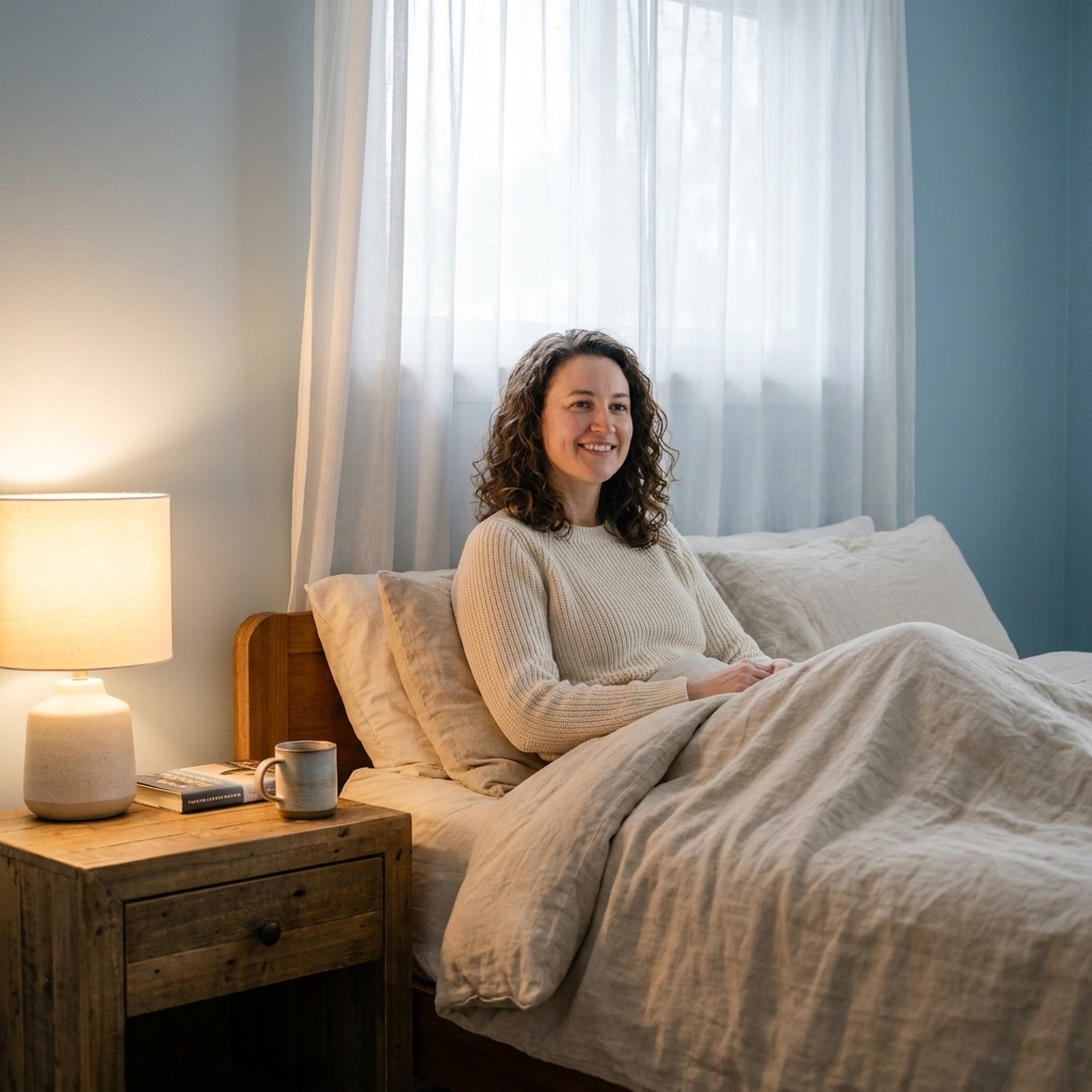
Why these colors feel calming
Most people seem to sleep best in a room that feels visually quiet. In practice, that usually means colors with:
- Lower chroma (more muted), so the wall color does not shout.
- Mid to deeper value (slightly darker, less bright), so the room does not feel energizing at night.
- Cool or balanced undertones that still read serene under warm bedside lighting.
There is also a simple behavioral piece here: if your bedroom looks restful, you tend to treat it like a rest space. Pair the right paint with dimmable, warm lighting and a soft bedding palette, and you have a room that gently cues “wind-down.”
Best color families
1) Soft, muted blues
If you want the classic “sleep sanctuary” color, start here. Muted blues read steady and quiet, and they naturally pair with warm wood, creamy bedding, and brass or black accents. The key is choosing a blue that is gray-washed, not sporty or primary.
- Best vibe: airy, quiet, hotel-calm
- Works well with: white oak, walnut, natural linen, warm metals
- Avoid: bright baby blues that can feel chilly or juvenile in low light
What to test for: In warm lamplight, some blues shift a little green or a little purple. Sample at 10 p.m. and see if it stays “calm blue” or turns “surprise aqua.”
Real paint picks to try: Benjamin Moore Smoke, Sherwin-Williams Misty, Farrow & Ball Borrowed Light.
Styling tip: If your blue walls ever feel too cool, warm them up with a camel throw, an ivory rug, and lampshades in linen or parchment tones.
2) Blue-greens
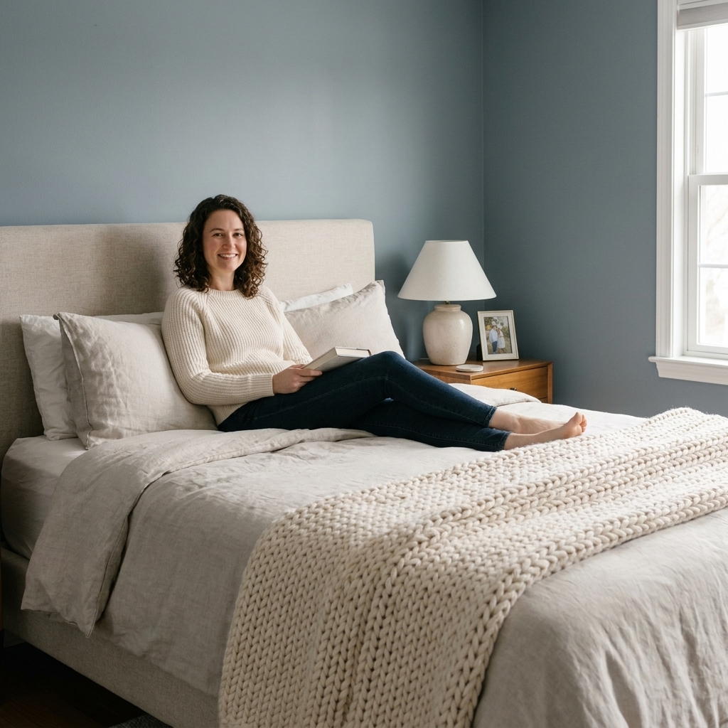
Blue-greens are my personal favorite because they read calm like blue, but they also have an earthy softness that feels grounding. Think sea glass, eucalyptus, or a foggy coastal morning. These shades can be surprisingly cozy at night, especially with warm bulbs.
- Best vibe: spa-like, grounded, nature-inspired
- Works well with: rattan, jute, vintage wood, creamy whites, terracotta accents
- Avoid: highly saturated teal that can feel energetic
What to test for: Blue-greens can look perfect in daylight and then read more gray at night, or swing greener under warm bulbs. Check it beside your bedside lamp.
Real paint picks to try: Benjamin Moore Palladian Blue, Sherwin-Williams Sea Salt, Behr In the Moment.
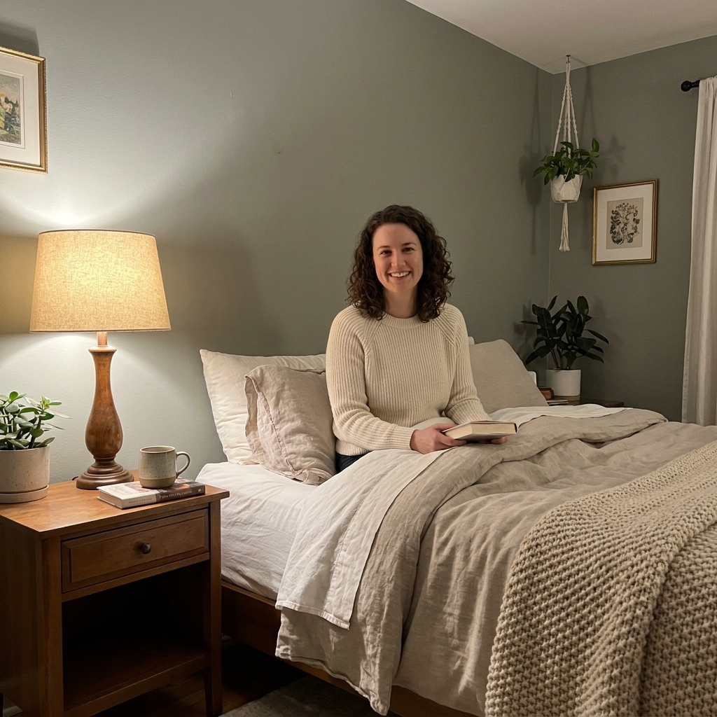
Styling tip: Add one or two “warmth anchors” so the room does not skew icy: a vintage wood nightstand, a warm-toned rug, or a soft tan pillow.
3) Sage and green-grays
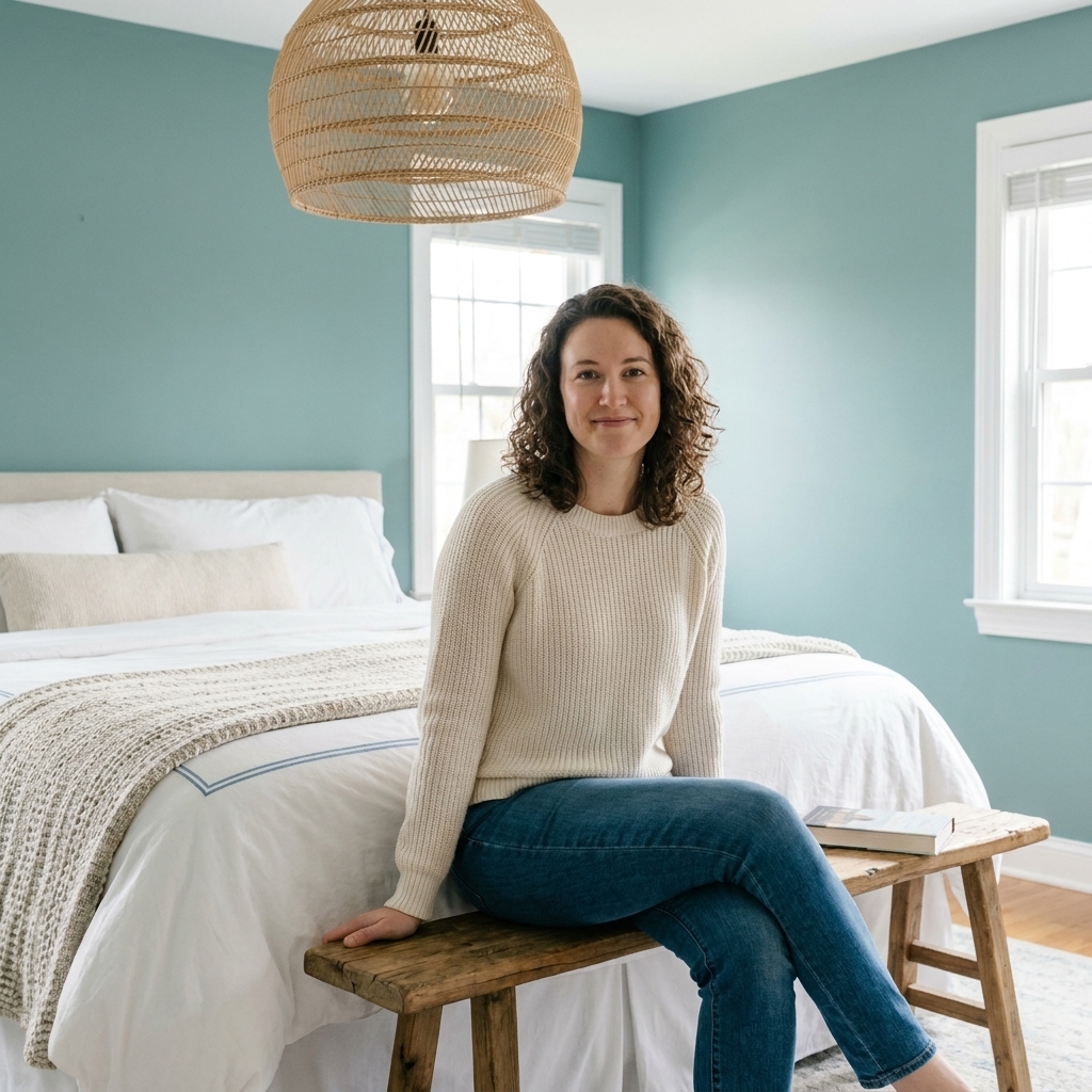
Sage and green-gray shades are wonderful when you want calm without the “cool coastal” vibe. They feel restorative and earthy, and they are forgiving in bedrooms with mixed finishes. The most sleep-friendly versions are the ones with a strong gray or dusty base, not grassy brightness.
- Best vibe: quiet cottage, modern organic, nature retreat
- Works well with: warm whites, aged brass, soft black, raw wood
- Avoid: yellow-green undertones if you dislike a glowy look at night
What to test for: Sage can “turn up the yellow” at night with very warm bulbs. If it looks a little chartreuse after dark, it is not the one.
Real paint picks to try: Sherwin-Williams Evergreen Fog, Benjamin Moore October Mist, Farrow & Ball Mizzle.
Styling tip: Sage looks dreamy with layered whites. Try a creamy duvet plus a slightly deeper ivory quilt so the bed feels dimensional against the walls.
4) Lavender-grays
Hear me out. A whispery lavender-gray can feel incredibly soothing because it is cool, soft, and not visually noisy. It is especially flattering in bedrooms with warm lamps and pale wood floors. The trick is keeping it muted so it reads like a foggy neutral, not a “purple room.”
- Best vibe: gentle, cocooning, slightly romantic
- Works well with: warm whites, soft gray bedding, antique brass, blush accents
- Avoid: clear violet tones that pop under daylight
What to test for: Lavender undertones can look more obvious in bright morning light. Check it near the window before you commit.
Real paint picks to try: Benjamin Moore Violet Mist, Sherwin-Williams Gris Morado.
Styling tip: Add texture instead of more color: bouclé pillows, a matte ceramic lamp, and a nubby wool rug.
5) Creamy off-whites
If color makes you nervous or you rent and want something universally easy, go with a soft warm neutral. In a bedroom, the goal is a white that feels buttery, not stark. Bright, blue-based whites can feel clinical, especially under cool LEDs.
- Best vibe: simple, cozy, everything feels clean
- Works well with: nearly any bedding palette, especially layered creams and tans
- Avoid: ultra-bright whites if you have lots of screens or reflective surfaces
What to test for: Creamy whites can go more yellow at night. If you are sensitive to that, pick a cream with a touch more gray in the base.
Real paint picks to try: Benjamin Moore White Dove, Sherwin-Williams Alabaster, Farrow & Ball School House White.
Styling tip: If you paint the walls creamy, make sure your bedding includes at least two distinct shades of white or ivory, plus one texture-heavy layer, so the room does not fall flat.
6) Greige and taupe
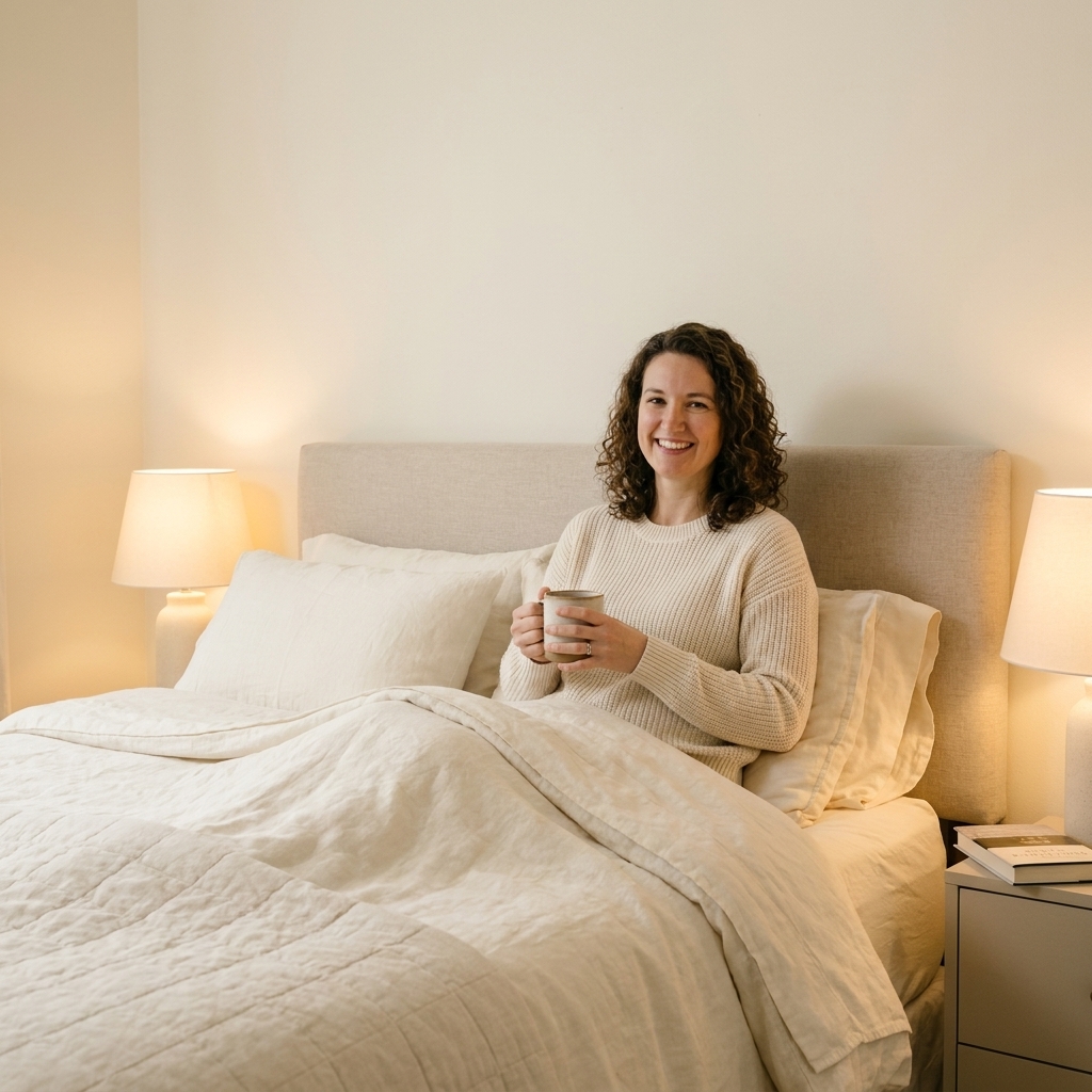
For anyone who wants neutral but hates “yellow beige,” greige is the calm middle. Mushroom taupes and soft putty tones are also excellent in bedrooms because they feel enveloping at night. These colors tend to play very nicely with dim lighting and darker wood furniture.
- Best vibe: grounded, quietly luxe, grown-up cozy
- Works well with: walnut, oak, black accents, woven textures
- Avoid: greiges that go pink if you already have pink-beige carpet or tiles
What to test for: Greige is a shapeshifter. It can read warmer next to wood floors and cooler next to bright white trim. Tape your sample near both.
Real paint picks to try: Sherwin-Williams Agreeable Gray, Benjamin Moore Edgecomb Gray, Farrow & Ball Elephant’s Breath.
Styling tip: Add one cool accent (a slate pillow, a smoky glass vase) to keep greige from leaning too warm overall.
Undertones matter
Two paints can be called “soft blue” and look totally different once they are on your wall. When you are choosing a calming shade, undertone is the dealbreaker:
- Blue with green undertone: often feels natural and spa-like.
- Blue with violet undertone: can feel dreamy, and sometimes cooler at night.
- Green with yellow undertone: can feel cheerful, but not always sleepy.
- Neutral with pink undertone: flattering and cozy, but can read rosy in warm bulbs.
- Neutral with gray undertone: quieter, but can feel flat if the room lacks texture.
If you are sensitive to color shifts, test anything with a yellow undertone carefully in evening light. That is when it tends to show itself most.
Lighting that helps
I have watched perfectly nice paint colors look completely wrong because of one thing: harsh bulbs. For a sleep-friendly bedroom, aim for:
- Warm light bulbs: around 2700K to 3000K for everyday bedside use. If you want extra cozy, candle-ish light for reading and winding down, many people prefer something closer to 2200K to 2700K.
- Dimmers or multiple light sources: overhead for cleaning, lamps for living.
- Soft lamp shades: linen, paper, or parchment tones diffuse light beautifully.
Cool tones like blue and sage tend to look their coziest when you counterbalance them with warm pools of light. Think: a lamp on each nightstand, plus a third low light across the room if you can swing it.
Sampling without drama
My no-drama sampling routine:
- Pick 3 to 5 contenders max. Too many samples turns into a paint museum.
- Use large swatches. Paint poster board or use big peel-and-stick samples.
- Move them. Tape them behind the bed, near the window, and beside your lamp.
- Check them at night. Bedroom paint must pass the 10 p.m. test.
- Compare to your fixed items. Floors, bedding, curtains, and your headboard are the real decision-makers.
If you are repainting just once and want to nail it, choose your bedding first. Walls are the supporting actor in a calm bedroom. Textiles are the star.
Quick picks by problem
Small bedroom that feels busy
- Try: soft blue-gray or creamy off-white
- Keep trim a similar tone (not stark white) to reduce contrast
North-facing room that feels cold
- Try: mushroom taupe, warm greige, or sage with a warmer base
- Use warm bulbs and avoid icy whites
Lots of bright sunlight
- Try: dusty blue or green-gray with a little depth
- Bright exposure can wash out pale colors, so you will often be happier going one shade deeper than you think, especially in higher sheens or rooms with lots of white furniture
Rental-friendly refresh
- Try: soft warm white for walls, then bring in color through curtains and bedding
- If painting is not allowed, mimic calm color with a large fabric headboard cover or removable wallpaper behind the bed
Colors that may feel energizing
Not because they are “bad,” but because they often add visual energy:
- High-saturation reds and oranges: stimulating, especially in large doses.
- Neon brights: they bounce light and feel active.
- Stark bright white: can feel like an office, and it amplifies clutter shadows.
- Very dark, glossy paint: dramatic, but reflections and high contrast can feel intense at night.
If you love a bold color, consider using it on a dresser, inside a closet, or in artwork, and keep the walls softer.
FAQ
Is blue the best color for sleep?
Blue is a common favorite because it reads calm to many people, but the best color is the one that feels quiet to you. If blue feels cold, a warm greige or mushroom taupe can be just as soothing, especially with soft lighting.
Should I paint the ceiling too?
If you want a cocoon effect and less contrast, yes. I love a color-drenched look in muted tones, especially in small bedrooms. If that feels like too much, keep the ceiling a softer version of the wall color rather than a bright white.
What finish is best?
Eggshell is my go-to for most bedrooms because it is wipeable but not shiny. Matte can look gorgeous and velvety, just know it may mark more easily in high-traffic spots. For trim, satin or semi-gloss is typical, and that sheen contrast can make trim look brighter, so avoid a super-bright trim color if you want the room to stay soft.
What if I have kids, pets, or humidity?
If your walls take a beating, stick with a washable eggshell and consider a scrub-resistant formula. For bath-adjacent bedrooms or damp climates, look for a paint labeled mildew-resistant, and keep air moving with a fan or dehumidifier so your beautiful calm walls stay that way.
Can I use a calming wall color with patterned bedding?
Absolutely. Patterns often look more restful when the walls are a muted solid. Pick a wall color that matches the quietest color in your bedding, not the loudest accent.
A simple color recipe
If you want a foolproof combo, try this:
- Walls: muted blue, blue-green, sage, or warm greige
- Trim: creamy white, not bright white
- Bedding: layered whites and ivories with one mid-tone (camel, slate, or olive)
- Lighting: two warm lamps, ideally on dimmers
Paint sets the tone, but texture finishes the job. The calmer your walls, the more your linen sheets, quilted blankets, and thrifted wood nightstand get to do their cozy magic.