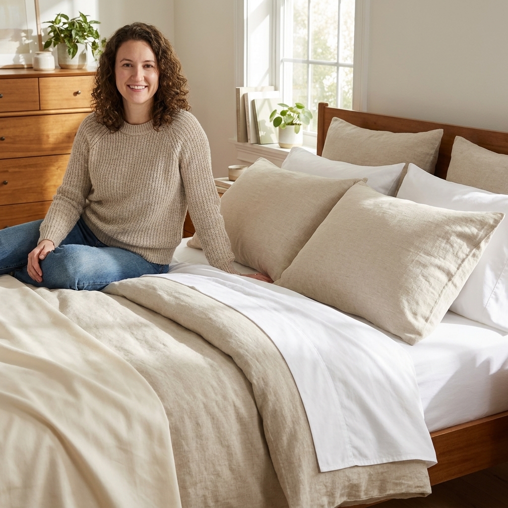
Mixing bedding patterns and textures is one of those “looks effortless” designer tricks that can feel weirdly stressful when you are staring at a pile of pillow covers. Here is the secret I learned the hard way in tiny rentals with zero closet space: a layered bed often looks cluttered when it has no plan. Once you choose a simple color story, vary the scale of patterns, and give your eye a few calm rest zones, you can combine florals, geometrics, stripes, linen, velvet, and knits without it turning into visual noise.
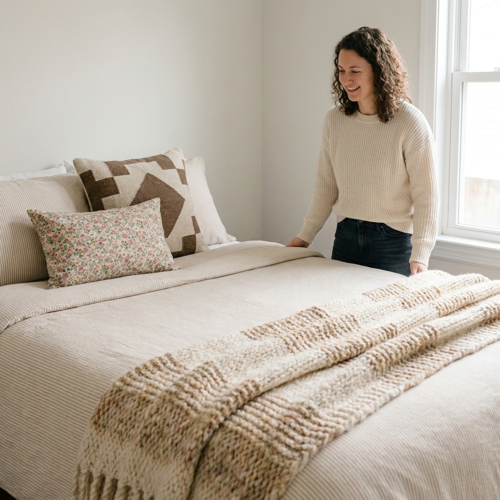
Start with a calm anchor
If you take only one tip from this article, let it be this: pick one anchor piece that reads as mostly solid from across the room. That anchor creates instant calm, which gives you permission to play everywhere else.
- Easiest anchor: a solid duvet cover or quilt in a mid-tone (warm white, oatmeal, soft gray, clay, dusty blue).
- Coziest anchor: a textured “solid” like linen, washed cotton, matelasse, or a subtle waffle weave. It is not flat, but it still reads quiet.
- Patterned anchor (yes, you can): choose something low contrast like thin pinstripes, tone-on-tone botanicals, or a tiny repeating motif.
When your anchor is calm, your patterns can be bolder without the bed feeling busy.
Use the 60-30-10 color rule
I love a simple ratio because it keeps you from adding “just one more” print and accidentally building a circus tent. Consider this a helpful starting point, not a law.
- 60%: your main bedding color (usually the duvet or quilt plus fitted sheet).
- 30%: your supporting color (often shams, a coverlet, or a couple of pillows).
- 10%: your accent (one statement pillow, a throw, or a patterned lumbar).
Pick two to three colors total, then repeat them across at least two items each. Repetition is what makes a mixed bed look intentional.
My thrift-friendly trick: bring a pillowcase or fabric swatch in your main color when you shop. If a find looks good next to that swatch, it is much more likely to work with what you already own once you get home.
Mix pattern scale
Most “cluttered” beds are not too patterned. They are too same-sized. When prints compete at the same visual volume, your eye cannot land anywhere.
A foolproof pattern scale trio:
- One large-scale pattern: big florals, oversized plaid, bold geometrics. Best on euro shams, a quilt, or one statement pillow.
- One medium-scale pattern: classic stripes, check, ikat, mid-size botanicals. Great for standard shams.
- One small-scale pattern: ditsy floral, pin dots, mini gingham, subtle speckles. Perfect for a lumbar pillow or sheet set.
If you already own a bunch of medium patterns, you do not need to replace everything. Just add one clearly bigger and one clearly smaller to create hierarchy.
Choose pattern families
You do not have to be a textile historian, but it helps to know which patterns naturally blend without drama.
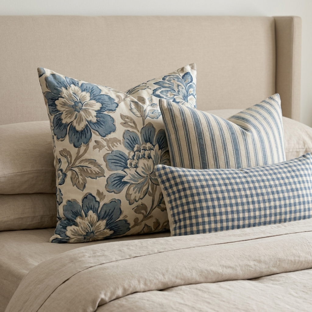
Florals + stripes
This is my forever combo. Stripes act like a neutral and make florals feel fresh instead of frilly. Keep at least one of them low contrast if you want an extra calm look.
Geometric + organic
Try a geometric (like a grid or diamond) with something softer (like a watercolor floral or leaf print). The contrast feels balanced, not chaotic.
Plaid + tiny print
Plaid brings structure. Add a small floral or dot in the same color family for that collected-over-time vibe.
One wild card only
Animal print, graphic abstracts, or very high-contrast black and white can look amazing in a bedroom, but choose only one wild card item. Let everything else support it.
Use texture to calm it down
Texture adds depth without adding more pattern, which is exactly how you get that cozy, designer layering while keeping the bed visually calm.
Think of texture like seasoning. You want a few different hand-feels:
- Matte + airy: linen, percale, washed cotton.
- Soft + cozy: brushed cotton, flannel (seasonal), jersey.
- Nubby + dimensional: waffle, matelasse, boucle, chunky knits.
- Sleek + rich: velvet, sateen (use sparingly if you like a less shiny look).
A simple formula I use constantly: pattern on the pillows, texture on the throws. It keeps the top half interesting and the bottom half calm and inviting.
Layer your bed
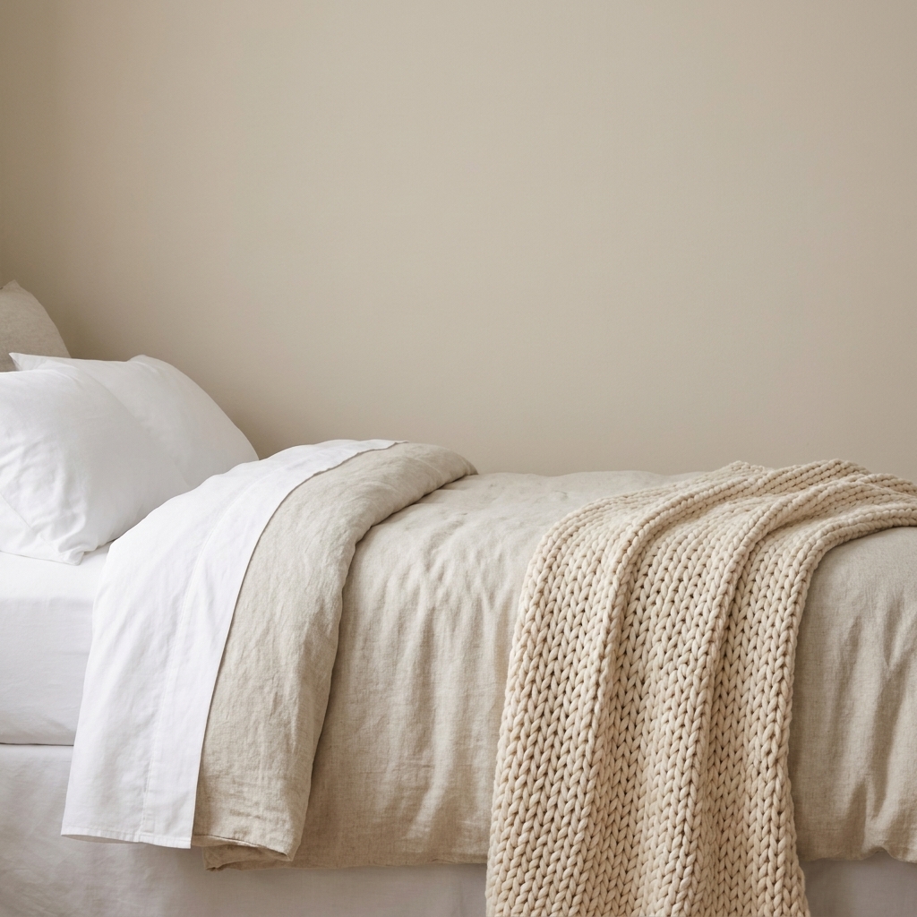
When you layer in a consistent order, the bed looks like a finished space instead of a linen closet spill.
- Base: fitted sheet and flat sheet (or just fitted if you are a duvet-only sleeper).
- Main layer: duvet or quilt (your anchor).
- Optional middle layer: a coverlet or thin blanket folded at the foot. This is where you can sneak in a subtle pattern or an extra texture.
- Sleep pillows: your regular pillows in shams or pillowcases.
- Euros (optional): great for structure, especially on larger beds.
- Accent pillow (1 to 2): one lumbar, or one square plus one lumbar.
- Throw: draped casually or folded with clean edges, but not both.
If you are in a small room, fewer layers can actually look more luxe because they read intentional.
Pillow sizing made simple
If proportions feel off, it is usually a sizing issue, not a pattern issue.
- Twin or full: skip euro shams unless you love the look. Two sleeping pillows plus one lumbar is plenty.
- Queen: two sleeping pillows plus two standard shams is the easiest “finished” stack. Add one lumbar if you want polish without bulk.
- King: euros can help the bed look proportional. Try two to three euros behind two king shams, then one lumbar in front.
My personal rule: if you find yourself shoving pillows onto a chair every night, your bed will start looking (and feeling) more chaotic than curated. Edit the stack until it matches your real routine.
Easy pattern math
When I help friends style a bed, I aim for one hero, one helper, and one quiet piece.
- Hero: your boldest pattern or strongest texture. Example: a large floral euro sham.
- Helper: something structured and classic. Example: ticking stripe standard shams.
- Quiet piece: a solid or near-solid that calms the whole stack. Example: a linen lumbar pillow in the duvet color.
Repeat one color from the hero pattern in the helper or quiet piece, and the whole bed suddenly looks designed.
Keep it from looking cluttered
Even a perfectly chosen mix can feel messy if the bed is visually crowded. These are the quick fixes I use all the time.
Leave negative space
Negative space is just breathing room. A solid duvet top, a plain sheet cuff, or a texture-only throw gives your eye a place to rest.
Limit the pillow count
- Low-fuss: 2 sleeping pillows + 1 lumbar.
- Balanced: 2 sleeping pillows + 2 shams + 1 accent pillow.
- Styled: add 2 euro shams, but keep accents to one lumbar.
Match the finishes
If your patterns feel like they are fighting, check the finish. A shiny sateen pillow next to a rustic slub linen and a fuzzy sherpa throw can look mismatched even if the colors match. Try keeping finishes in the same vibe: mostly matte, mostly relaxed, mostly crisp, or mostly plush.
Keep contrast consistent
Mixing patterns works best when the contrast level is similar. If you have one super high-contrast black and white print, balance it with lower-contrast patterns in the same palette. Also worth noting: high contrast can feel energizing in a sleep space, so if you are sensitive to visual stimulation, go softer and tone-on-tone.
Copy-and-paste combos
If decision fatigue hits you hard, pick a combo and run with it. You can swap colors to match your room.
Soft and romantic
- Solid linen duvet in warm white
- Ditsy floral standard shams in blush and sage
- Thin ticking stripe lumbar in warm white and tan
- Matelasse coverlet folded at the foot
Modern cozy
- Solid quilt in oatmeal
- Grid pattern euro shams in taupe
- One small geometric pillow in black and cream
- Chunky knit throw in caramel
Vintage collected
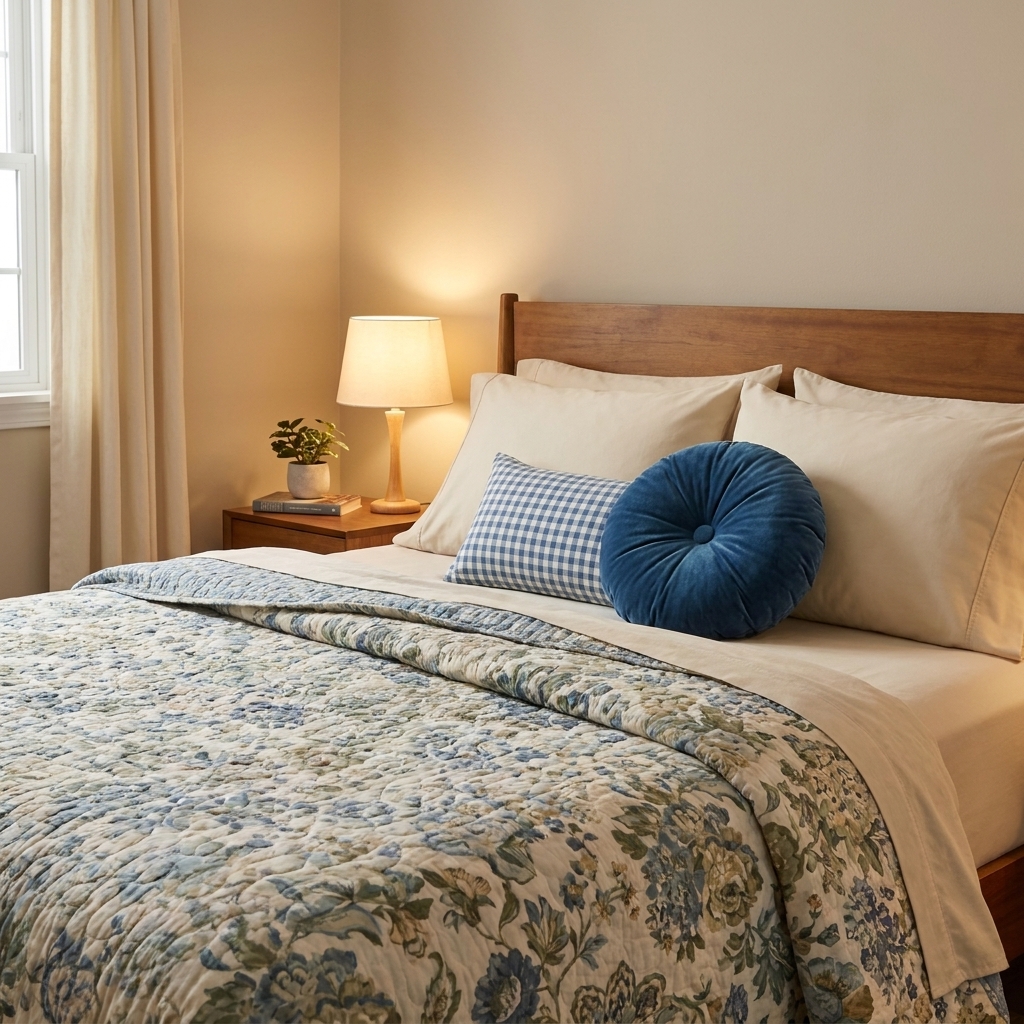
- Muted floral quilt as the anchor
- Solid pillowcases in one quilt color (dusty blue or buttercream)
- Small gingham lumbar
- Velvet throw pillow in a deep accent (rust or forest)
Thrift and budget tips
You absolutely do not need a matching set to get a high-end look. Honestly, sets are often the reason beds look flat.
- Buy pillow covers, not full pillows: swap covers seasonally and store them in a small bin.
- Check curtain sections for textiles: linen blend curtains can become euro shams or a coverlet look if you fold them at the foot.
- Use a consistent insert color: white or ivory inserts make most covers look cleaner and more consistent, but if your cover is very dark or thin, choose an insert that matches the cover color so it does not peek at seams or zippers.
- Commit to one nice anchor: spend a little more on the duvet cover or quilt you touch every day, then thrift patterns for the pillows.
- Embrace imperfect matches: slightly off patterns are what make a bed feel collected. The key is repeating a color and varying scale.
Material and laundry check
Before you fall in love with a mix of textures, do a quick care reality check. Linen and washed cotton are easy weekly drivers, but velvet covers, chunky knits, and specialty weaves can be pickier.
- Try to keep your core layers (sheets and main duvet cover) on a similar wash schedule.
- If something is spot-clean or dry-clean only, make it a small accent, not your main layer.
- Chunky knits can stretch and snag, so treat them like a throw, not an everyday blanket that gets yanked around.
Common mistakes and fixes
Everything is patterned
Fix: swap just one item for a solid or a texture-only piece. A plain linen sham or a solid throw can calm the whole bed instantly.
Patterns feel like they are shouting
Fix: reduce contrast. Replace the darkest item with a softened version, or introduce a bridging color with one solid pillow.
It feels busy with only two patterns
Fix: the scales are too similar. Make one larger or smaller. A big plaid plus a tiny floral usually works better than two medium prints.
Textures feel random
Fix: choose a texture theme: relaxed and matte (linen, cotton, knit) or plush and luxe (velvet, faux fur, sateen). Mixing can work, but it is harder to pull off in small spaces.
Quick checklist
- Do I have a calm anchor (solid or quiet texture)?
- Are my patterns clearly different sizes?
- Am I repeating at least one color across two items?
- Do I have at least one rest zone with no pattern?
- Will I actually move these pillows every night?
If you can say yes to most of those, you are not cluttering. You are curating.
FAQ
How many patterns can you mix on a bed?
As a starting point, three is a very workable number for most bedrooms: one large, one medium, one small. You can go up to four if one of them is very subtle, like a thin stripe that reads almost solid.
Can you mix florals and geometric prints?
Yes, and it is one of my favorite combinations. Keep the color palette tight, then vary scale so they do not compete. A big floral plus a small grid is an easy win.
What is the easiest bedding to mix with patterns?
Solid linen or washed cotton. It adds texture, looks relaxed, and plays nicely with almost every pattern family.
How do I mix patterns if my room is already colorful?
Pull one color from your room as the main bedding color, then keep your patterns lower contrast. In a colorful room, softer prints read intentional instead of loud.